Plot system
The Thunor Plot System is an interactive visualization platform for high-throughput screen data. It supports multiple types of plots, a panelled interface for displaying multiple plots at once, plot interactivity (e.g. hovering mouse to view coordinates of a point), and exporting PNG or SVG graphics or raw data (JSON or CSV) from plots.
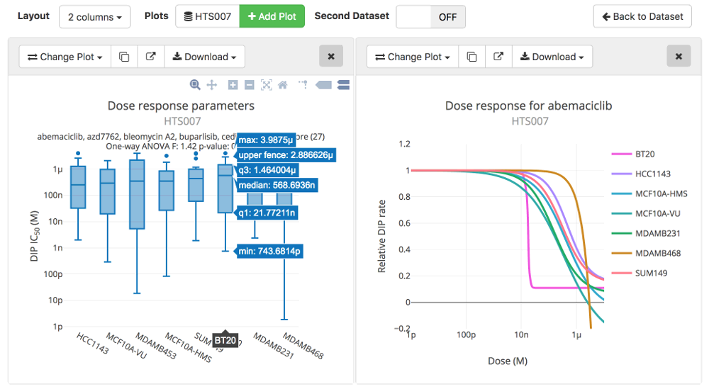 Image: Part of the Thunor Web plot system interface, showing box plots and dose response curves.
Plot System Layout
The plot system consists of a master toolbar (with Layout, Plots, and Dual Dataset Plot sections). The Layout section may not display on narrow devices (e.g. mobile phones). A Quick start guide is displayed until the first plot is loaded, whereupon it's replaced with the plot panel.
Select a dataset
Under the Plots section in the master toolbar, there is a button showing the currently active dataset, if there is one, or Select Dataset if no dataset is active. To change the currently active dataset, click on this button at any time.
Clicking the dataset button will bring up a panel to select a new dataset. This panel is the same as the one on the home page of Thunor. Select a group from the available tabs at the top, then click a dataset name to select it. You can also search for a dataset by name using the search box. Click the X in the top right to close the panel without changing the dataset.
Dual dataset plots
Multiple plots can be loaded at the same time, by changing the active dataset (see above) and clicking Add Plot iteratively for each desired plot. By contrast, dual dataset plot is a feature that compares two datasets on the same plot.
To activate this feature, click the switch next to Dual Dataset Plot to ON. A second dataset button appears in the Plots section of the master toolbar, which can be clicked to change the active second dataset. Note that plot panels with two datasets loaded will have a different set of plot types available. This setting only affects new plot panels - already loaded plots are unchanged (you can sequentially load multiple plots from different datasets or dataset combinations).
To turn off this feature, toggle the Dual Dataset Plot switch to OFF.
Add a plot
To add a plot, click the Add Plot button. Note that if no dataset is currently active, you will be shown the dataset panel to select one first. A new "plot panel" will appear - a box with a grey header bar and a plot area, which is blank until a plot is selected.
The plot type is selected using the Change plot button, which is selected by default when a new plot is added. The options panel then appears with options for the current plot. For details, see Choose plot options, below.
Plot types
The plot type is chosen from the options panel, which can be accessed on any plot at any time by click on the Change plot button.
To use the options panel to create or modify a plot, first select a plot type, then enter options specific to the plot type, if applicable, then click the Show Plot button.
Time Course
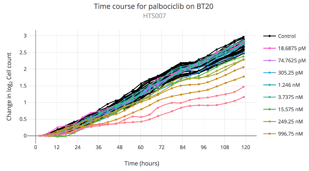 Image: Thunor Web time course plot example, showing the change in log2 cell count (i.e. cell population
doublings) over time.
A Time Course plot show the change in an assay value (typically, cell count) over time. The x-axis shows time in hours, and the y-axis shows the change in assay value. It is not available for panels with two active datasets. The following plot options are available:
- Cell Line. Only a single cell line can be selected at a time for this plot type. Select from the list or type a name.
- Drug. Only a single drug (or drug combination) can be selected at a time for this plot type. Select from the list or type a name.
- Vertical Axis (DIP rate only): Doublings (log2) uses a log base 2 y-axis showing change from baseline (i.e. the axis starts from zero), Linear uses a linear (untransformed) y-axis.
- Overlay Dip Fit (only available for log2 vertical axis on DIP rate data) Turn this option on to overlay the DIP rate fit on the cell count data (a straight line on a log2 plot). Allows a visual assessment of goodness of fit.
Dose Response Curves
 Image: Thunor Web dose response curve examples, showing the relative DIP rate by dose. Left: A single dose response
curve with experimental (red) and control (black) data points. Values can be displayed by hovering the mouse, or
tapping on touch devices. Right: Multiple dose response curves can be overlaid, and colored by cell line, drug, or tag.
A dose response curves plot shows fitted dose response curves to the DIP rates. If only a single cell line/drug (or drug combination) is selected, the DIP rate data points are shown, to allow a visual assessment of goodness of fit. The following plot options are available:
- Cell Line. One or more cell lines can be selected by name or by tag. Tags are collections of cell lines annotated with a label (see Tag System). Select cell lines by clicking on them or typing a name to search after clicking the dropdown box. To use tags, click the Tags button and select one or more tags, by clicking or typing their names.
- Drug. One or more drugs can be selected by name or by tag. Tags are collections of drugs annotated with a label (see Tag System). Select drugs by clicking on them or typing a name to search after clicking the dropdown box. To use tags, click the Tags button and select one or more tags, by clicking or typing their names.
- Color overlay: Specify how to color and group the dose response curves. By default, each curve will receive a different color. You can also color the curves by cell line or drug by selecting those options.
- Response metric: Show response curves for Viability or DIP rate. This option is only shown if the dataset has the multiple time points required for DIP rate calculation.
- Vertical axis (DIP rate only): Select Relative to use relative DIP rate (minimum effect, E0, is set to 1), or select Absolute to use an absolute scale y-axis.
For details on the curve fitting process, see curve fits.
Dose Response Parameters
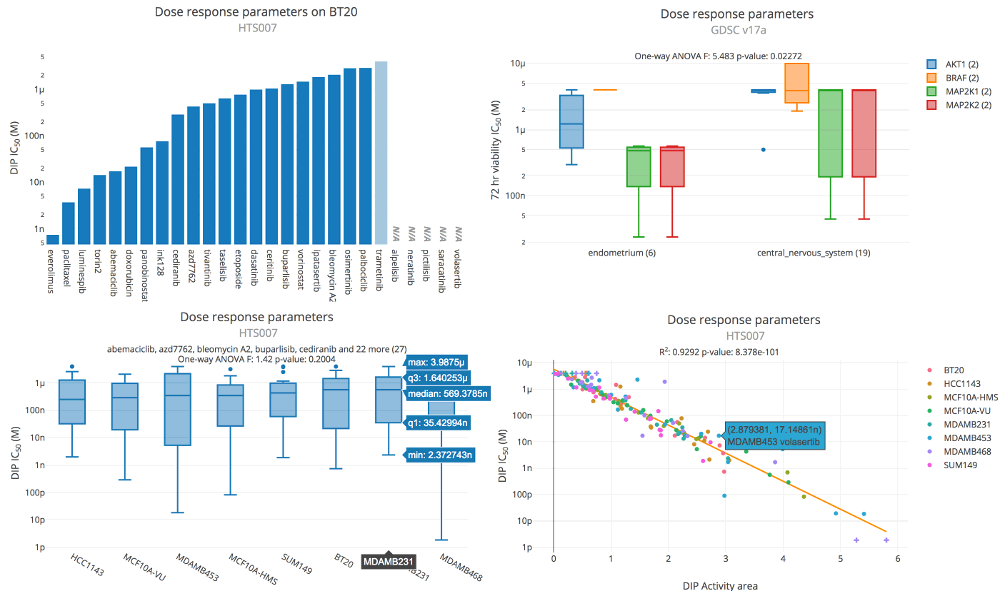 Image: Thunor Web dose response parameter plot examples. Upper left: Bar plot showing DIP rate IC50
across a selection of drugs. Upper right: Box plot showing viability IC50 across two tissue types
(endometrium and central nervous system) and four molecular drug targets (AKT1, BRAF, MAP2K1, MAP2K2). The tissue types
and drug targets are defined as tags (see tag system). Bottom left: Box plot showing DIP IC50.
Each box shows the IC50 values across 27 drugs for a particular cell line (x-axis label). Bottom right:
Scatter plot showing DIP activity area (x-axis) versus DIP IC50 (y-axis). Each point represents a cell
line/drug combination, colored by cell line. The orange line represents the best fit from linear regression.
A Dose Response Parameters plot shows parameters extracted from dose response curve fits, such as IC50 and EC50. Depending on the plot options, the plot may be a bar plot, box plot, or scatter plot. Bar plots are used to visualize a single parameter, box plots for a range of parameters on aggregated data, and scatter plots for comparing two different parameters, or the same parameter across two datasets.
On scatter plots, some parameter values get "truncated" - the value is set to the outer limit of the measured range, where the model estimate lies outside of that range (e.g. an EC50 which is higher than the maximum measured concentration). This is denoted with a red cross symbol.
Bar and box plots are sorted in ascending order of the selected parameter by default, but this can be overriden by the Ordering Parameter option described below.
For descriptions of each of the parameters, see dose response parameters.
The following plot options are available:
- Cell Line. One or more cell lines can be selected by name or by tag. Tags are collections of cell lines annotated with a label (see Tag System). Select cell lines by clicking on them or typing a name to search after clicking the dropdown box. To list parameters for each cell line separately, click the Separate button, otherwise use Aggregated to combine them as a group. To use tags, click the Tags button and select one or more tags, by clicking or typing their names. Parameters are shown for each tag separately if Separate is selected, otherwise they can be Aggregated (all constituent cell lines are shown as a group).
- Drug. One or more drugs can be selected by name or by tag. Tags are collections of drugs annotated with a label (see Tag System). Select drugs by clicking on them or typing a name to search after clicking the dropdown box. To list parameters for each drug separately, click the Separate button, otherwise use Aggregated to combine them as a group. To use tags, click the Tags button and select one or more tags, by clicking or typing their names. Parameters are shown for each tag separately if Separate is selected, otherwise they can be Aggregated (all constituent drugs are shown as a group).
- Color overlay: Specify how to color and group the plot data. The plot traces can be colored by cell line or drug if required. This option also affects the groups defined for statistical tests, if applicable. Color overlays are not currently supported with box plots.
- Response metric: Show response curves for Viability, DIP rate, or Compare. This option is only shown if the dataset has the multiple time points required for DIP rate calculation. The Compare option uses the viability version of a metric on the x-axis, and the DIP rate version of a metric on the y-axis.
- Parameter defines the dose response parameter to visualize. These are grouped by inhibitory concentration (e.g. IC50), effective concentration (e.g. EC50), effect size (e.g. Emax, E50), or other (Hill coefficient or Activity Area). When selecting a parameter marked with
(custom value)a custom integer value between 0 and 100 may be entered. This allows parameters like EC25. - Second Parameter can be toggled on or off with a switch. Toggle to ON to compare two parameters against each other. The available parameters are the same as the first parameter.
- Ordering Parameter can be toggled on or off with a switch. It cannot be combined with a Second Parameter. The Ordering Parameter defines the x-axis ordering. This can be used to aid direct comparisons between two parameters, by keeping the ordering the same across two plots. In addition to sorting by a specific parameter, there is an option for alphabetical sorting by x-axis label.
The following statistical tests are performed:
- On scatter plots, a line of best fit is calculated using linear regression and shown as an orange line. Data points which are truncated in either axis are excluded from the fit. The R2 and p-value for the fit are shown above the plot.
- On box plots, a one way analysis of variance (ANOVA) is calculated, which tests for statistically significant difference in means of a dose response parameter across the groups. Please note that, depending on the groups used for the box plots, an ANOVA test may not be statistically appropriate - it is down to the user to consider whether it is so. In particular, one-way ANOVA assumes that (1) Response variable residuals are normally distributed; (2) Population variances are equal; (3) Responses for each group are independent and identically distributed (i.i.d.), and normally distributed random variables.
- On bar plots, if certain criteria are met, a two-sided Mann-Whitney U test is calculated, which tests for statistically significant difference in the ranks of two random variables. Here, Thunor will test for the difference in the ranks of a dose response parameter (e.g. IC50) between two groups (cell lines, drugs, or tags). The test will only be run if the plot contains exactly two groups (defined by the number of cell lines/drugs/tags and the "color by" option), and both groups contain more than 20 data points. The test has continuity correction applied. The test assumes that data points are independent.
Quality Control
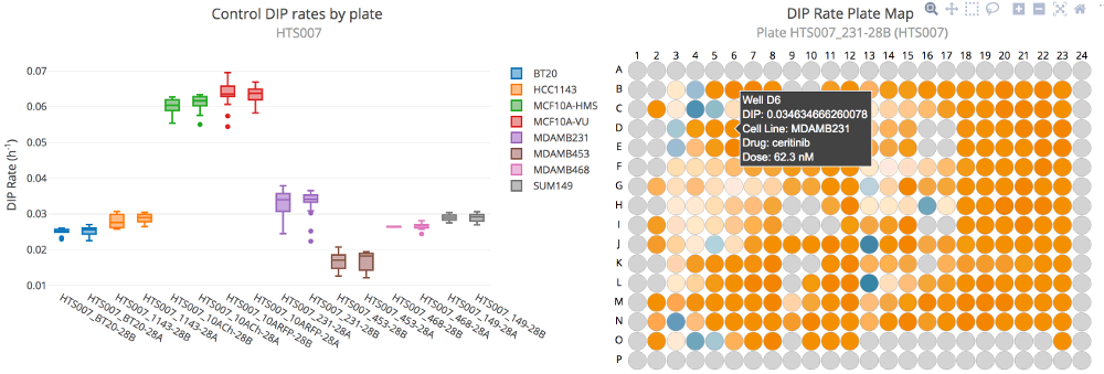 Image: Thunor Web quality control plot examples. Left: Box plot of control DIP rates by plate and cell line.
Right: Plate map showing DIP rate as a heat map across a plate. Positive DIP rates are shown in orange; negative in
blue.
Quality Control plots are used to check for experimental anomalies within a dataset.
Three options are available:
- Control DIP Box Plot shows the distribution of control DIP rates across each plate as a box plot. This can be used to spot plates with a wide distribution of control proliferation rates, or large differences in control proliferation rates across different plates with the same cell line.
- DIP Rate Plate Map shows a representation of the plate map, with wells colored by DIP rate. This may be useful for spotting spatial effects within a plate, e.g. cells at the plate edge grow more slowly in control.
- Control Cell Count Box Plot shows the distribution of control cell counts for a viability (single time point) dataset. Note that this is only a meaningful quality control check if starting cell counts (seeding density) for each cell line are tightly controlled and equal across wells and plates at the start of the experiment. Assuming this is so, the plot can be used to spot plates with a wide variation of control cell counts at the end-point or large differences in control cell counts across different plates with the same cell line.
Why are some cell line or drug names shown in italics?
On the drop down boxes to select cell lines and drugs, you may notice that entries may appear in black, grey, or gold. The colors indicate the availability of data for the currently selected cell line(s) on the drug dropdown box, and vice versa. For example, if the cell line SKMEL5 is selected, drugs in the drug dropdown will reflect the availability of data for each drug for SKMEL5. The color scheme is as follows:
- Black indicates data for the drug is available for the currently selected cell line(s) (or vice versa)
- Grey indicates data for the drug is not available for the currently selected cell line(s) (or vice versa)
- Gold italics indicates data for the drug is available for a subset of the currently selected cell lines. In the case of a plot with two datasets, data might only be available for one of the datasets.
Therefore, for datasets where all cell line/drug combinations have data, all cell line and drug entries will appear in black.
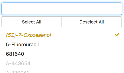 Image: Thunor Web drug selection color indicator, which shows data availability by drug for the currently active
selection of cell lines.
The color scheme is not used when cell lines or drugs are selected by tag.
Notes on using tags
Tags can be used to select and group cell lines or drugs (see tag system). Tags are listed by category and can be searched using the search box.
At the bottom of the list is a special tag, Everything else. This selects every cell line or drug that is not otherwise selected by the list of tags. This is useful for comparing a tag to everything else in the dataset. This option works best either with aggregation switched on (to get box plots), or with aggregation switched off and a single entry in the other dropdown box (i.e. a single drug if using Everything else with cell line tag(s), or vice versa).
Create a tag from a plot
In bar and scatter plots, one can create new tags from within the plot interface. This can be useful for defining new tags based on patterns, trends, or outliers observed in a dataset. First, you'll need to create a selection. Hover over the plot, and you'll see the plotly modebar in the top right of the plot (a set of icons). Click either the Lasso select or Box select option, and draw round a set of points (scatter plots) or bars (bar plots). You can add to the selection by holding Shift and drawing another box/lasso. To deselect, double click within the plot area.
With a selection active, you'll see a new menu on the main plot toolbar, illustrated by an arrow, next to the Download button. The number in parentheses on this button indicates the number of selected data points. Click on this menu, and you'll have to the choice to create either a Cell line tag or Drug tag based on the selection. When clicking either of these options, a pop-up window will appear showing the cell lines/drugs the selection contains, each with a checkbox next to it (checked by default). You can uncheck any of the cell lines/drugs to remove them from the new tag if desired. Give the new tag a name and category (text boxes at the bottom of the popup). Then click the Save as tag button. The plot selection menus will automatically refresh, giving access to the new tag.
Modify an existing plot
To modify an existing plot, click the Change plot button.
Duplicate a plot
An existing plot can be duplicated by clicking the Duplicate button in the plot header. This is useful for comparing a plot against a similar plot with a slight modification.
Open a plot in a new window
An existing plot can be opened in a new window by clicking the Open in new window button in the plot header. The icon is a box with an arrow pointing outwards.
Rearrange plots
Plots can be rearranged by clicking and dragging (or tapping and dragging, on touch devices) on the plot header grey area (not on any button). If the screen is wide enough, the number of columns can be changed by selecting it from the dropdown box under Layout in the master toolbar.
Close a plot
Click the "X" button in the top right of the plot header.
Interact with a plot
Thunor's plot interface uses plotly, which provides interactivity and vector graphics which look sharp on any size screen.
Hover over a plot (or tap, on touch devices) to see a toolbar in the top right of the plot area. This provides options for adjust the plot view. Some useful options are:
- Hover the mouse over any data point or plot object to view the raw data values.
- Autoscale adjusts the axes to what plotly considers a sensible range. Either double click on the plot when the "crosshairs" are showing, or select the Autoscale button from the plotly toolbar.
- Zoom by using the options in the plotly toolbar, or by clicking and dragging a bounding box on the plot area.
Download graphics or data
Plot graphics and data can be downloaded using the Download button on any plot header.
- PNG image is a bitmap image type, well supported by most graphics software. Bitmap images have a fixed resolution and may become pixellated when printed or when zooming in.
- SVG image is a vector image type (Scalable Vector Graphics), supported by most graphics software. Vector images contain data on the constituent graphic objects, which means they look good at any resolution. Ideal for publications or poster printing.
- Plotly JSON contains the code used to render the plot using the plotly library. This option is useful for those who want to edit their plot using the plotly library, e.g. in R or JSON, or to host a copy of the plot on their website.
- CSV contains the plot data in comma-separated value format.
- HTML contains the plot as a web page (HTML), with all of the required software to display the plot saved in the single HTML file. This creates a relatively large file size (typically around 1 Mb), but is suitable for archiving a plot without any external dependencies.
A note on graphics formats
For publication quality images, we recommend using the SVG image format. SVG is a vector graphics format, which can be rescaled without loss of quality.
SVG can be converted into PDF or EPS formats using Inkscape. You can use Inkscape's graphical interface, or the following command:
inkscape fig.svg --export-pdf=fig.pdf
Share or save a plot session
The URL of the page is updated as plots are displayed. Therefore, to save a plot session, simply bookmark the page. To share the plot session, you can share the URL. Note that the URL can get rather long if many plots are open.
Exit the Plot System
Click the Back to Home Page button at the top right of the page. Please note that any currently open plots will not be saved automatically.